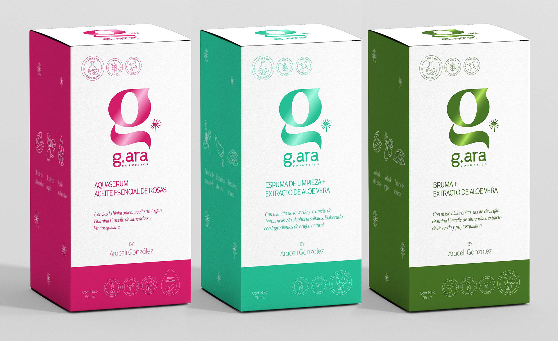
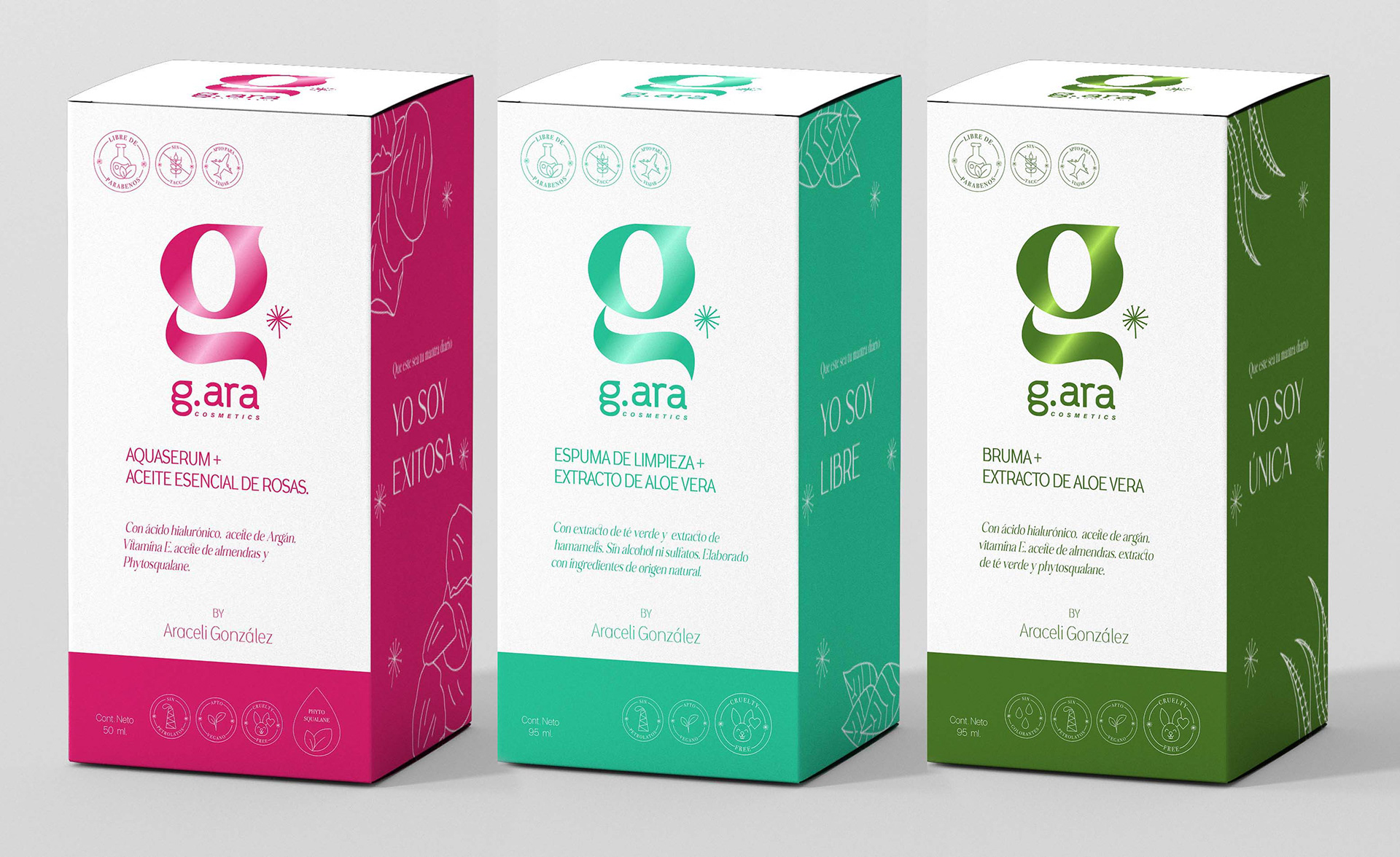
These are mockups that I designed for the upcoming Skin Care line for G.ara. I played with the different colors of the ingredients. The client wanted something "fun and clean". I utilized rounded letters and vibrant colors to give it a fresh and playful feeling.
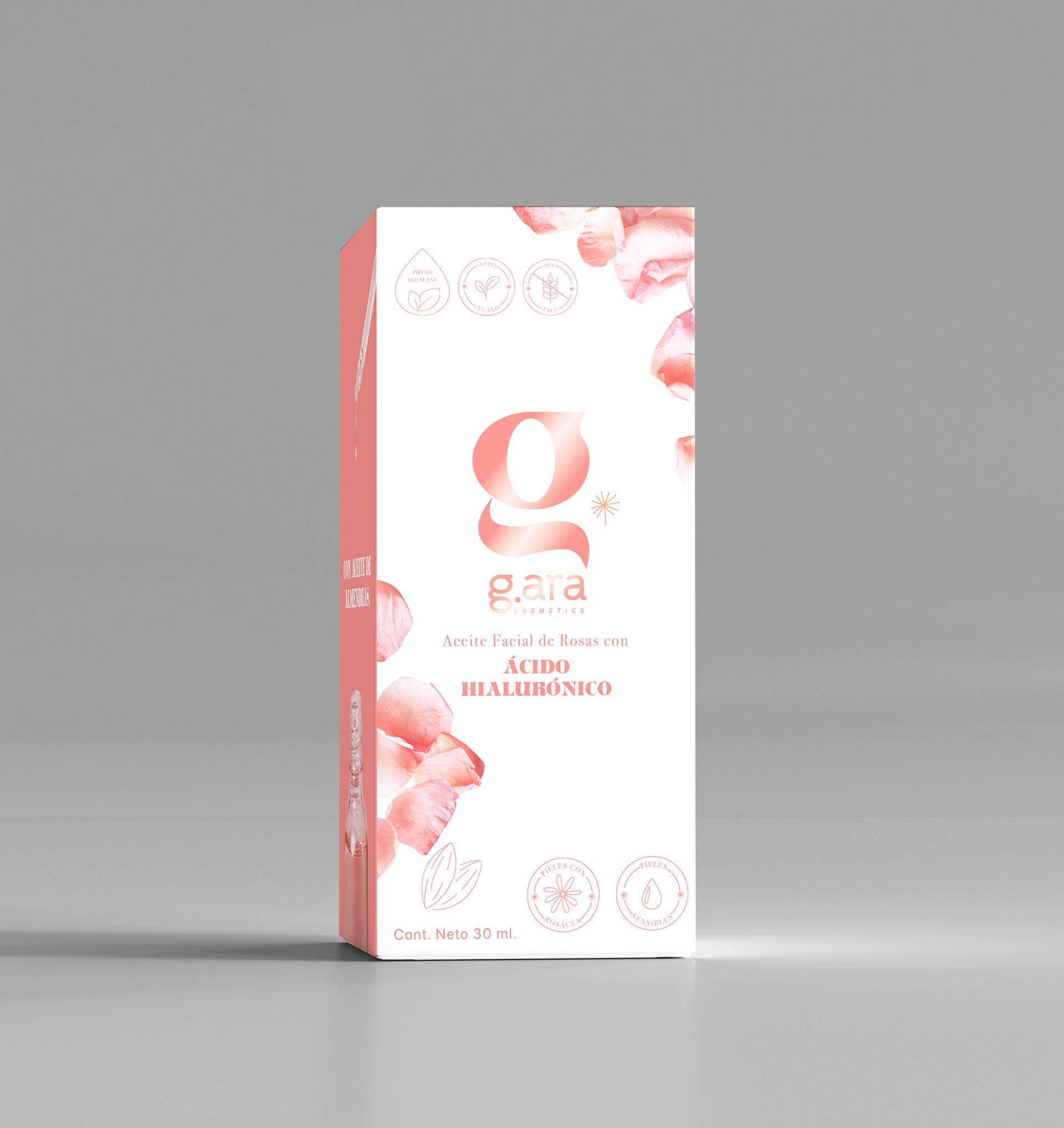
In this design I brought the logo to the front and went with a softer color, because the primary ingredient of this face oil is roses. It was important to me to convey the feeling of softness and freshness to the future costumer.
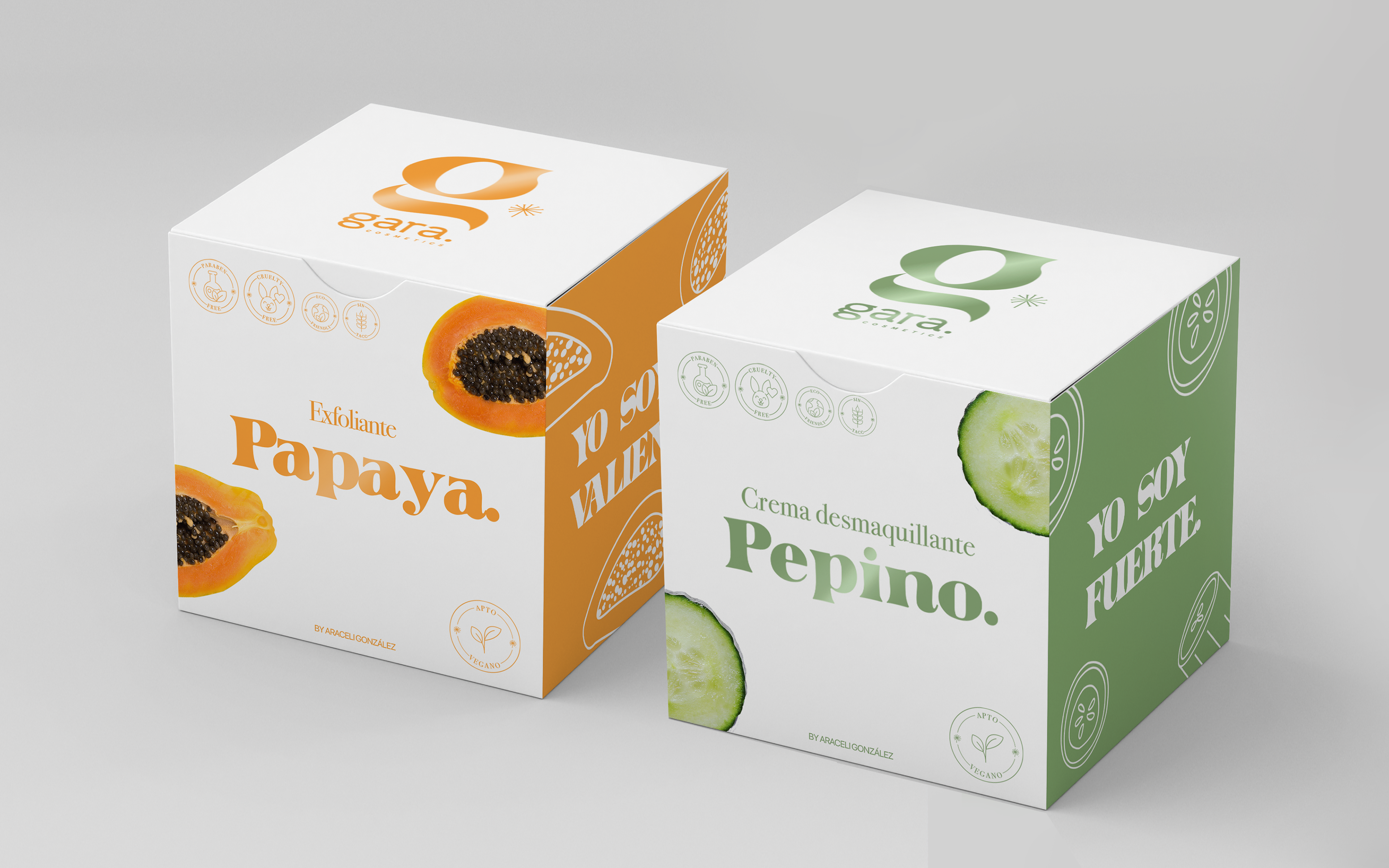
And, last but not least, these are other optional designs that I presented to the client. I went for a little bit more serious and sober style but also maintaining the vibrant colors and some of the drawings on the side. Also I wanted the client to have a different alternative without the photographs of the fruits in the design, since photographs can be quite expensive to print in packagings here in Argentina.